_FINALVERSION
AREAS
Rebranding, Graphic Design, Social Media
YEAR
2024
SOFTWARE
Illustrator, Photoshop InDesign

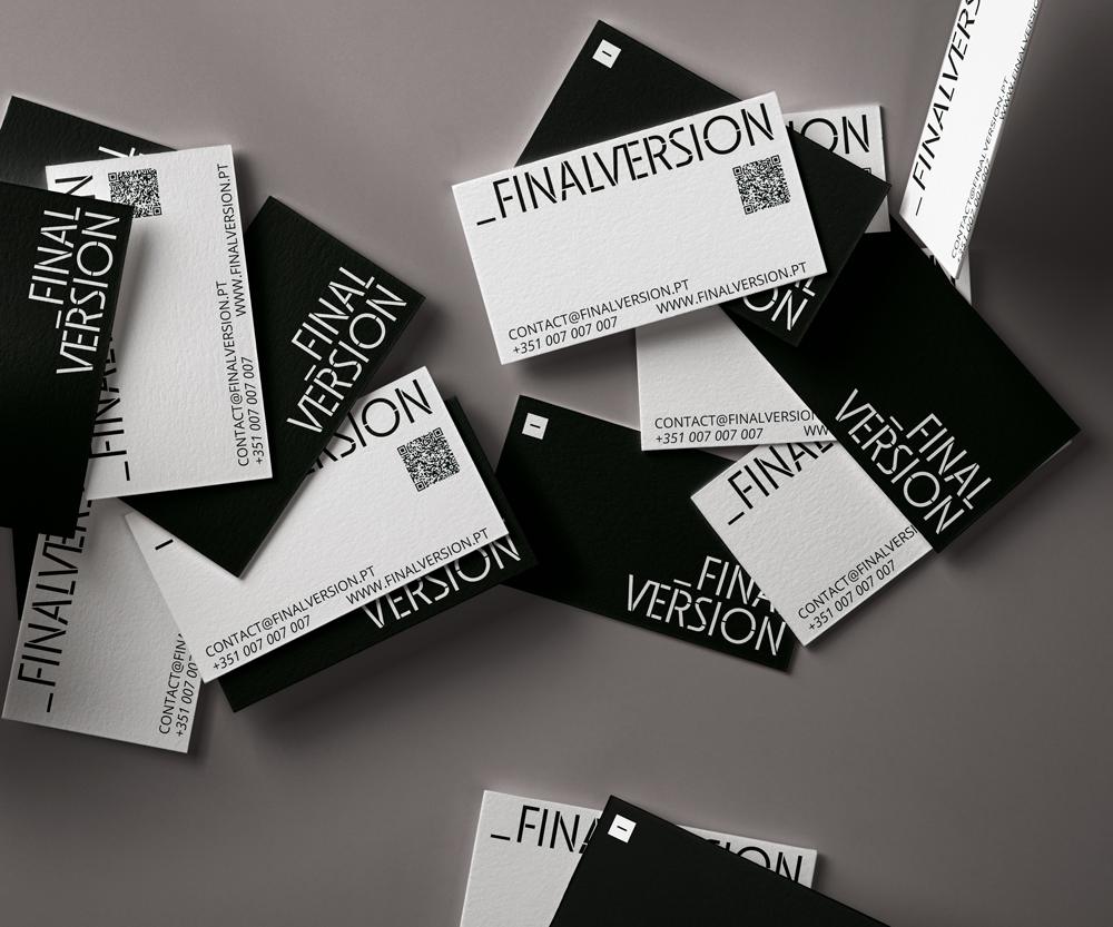
The rebranding of Finalversion, a multifaceted digital creative agency, focused on keeping the core elements of the original identity while giving it a more professional look. The underscore symbol, which precedes the name, remained central to the logo. However, this time, the lettering shifted from lowercase to uppercase, reflecting a more polished and professional tone.
The new visual identity is simple, bold, and premium. The color palette continues with blacks, whites, greys, and a green tone, but the colors are now more digital-focused, moving away from the pastel shades used previously.
The new logo is designed to look as though it's built from underscores, symbolizing the creative process behind the agency. Just like in the agency's work, each department contributes a part, and everything comes together in the final result. To reinforce the concept, a rectangle is used in the visual identity to highlight certain parts of the text, resembling the caution tape commonly seen in construction zones, where the same phrase or word is repeated.
This project was developed while working at Finalversion.
RaiosRita 2024©
design@raios-rita.com
BianZhiDai by Xiaoyuan Gao, notyourtypefoundry & PicNic by Mariel Nils. Distributed by velvetyne.fr.


