CHEZ PAULA
AREAS
Branding, Graphic Design, Social Media, Motion
YEAR
2025
SOFTWARE
Illustrator, Lightroom InDesign, After Effects
COLLABORATION
Gonçalo Silva
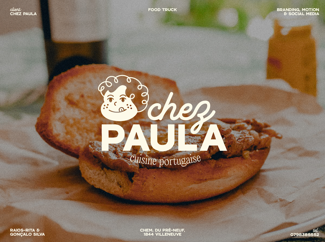
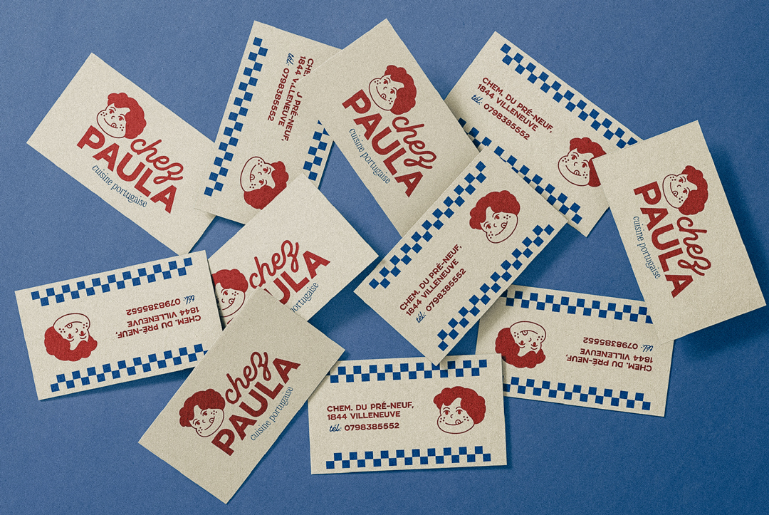
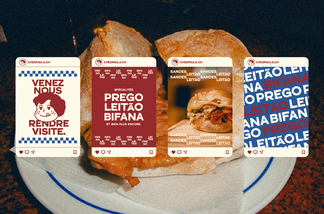
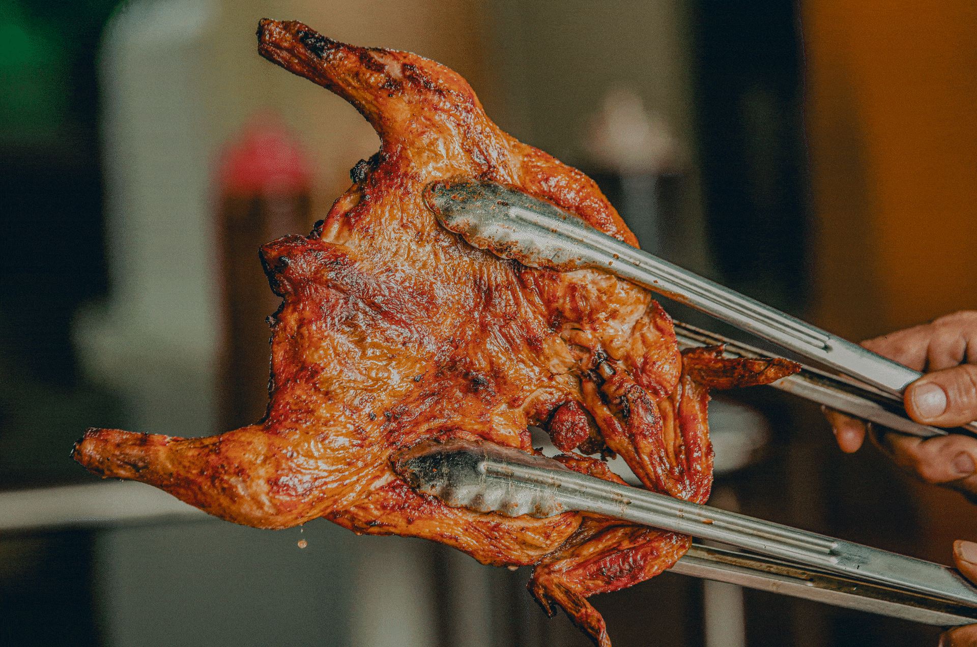
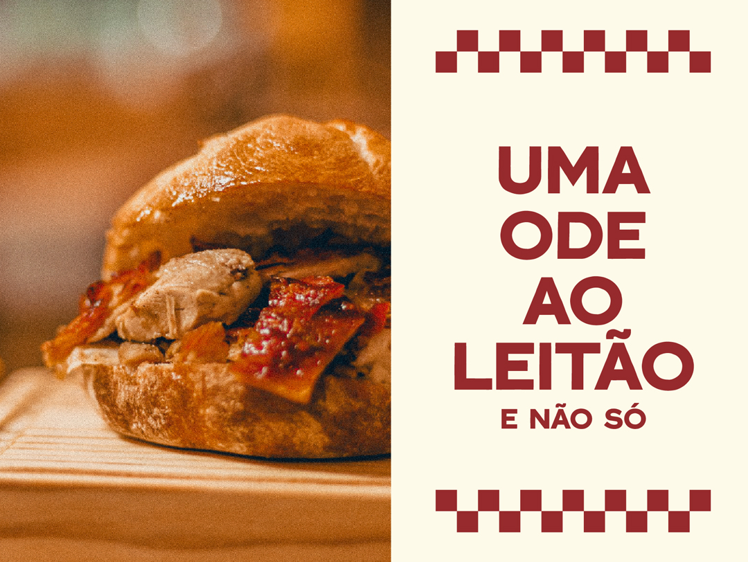
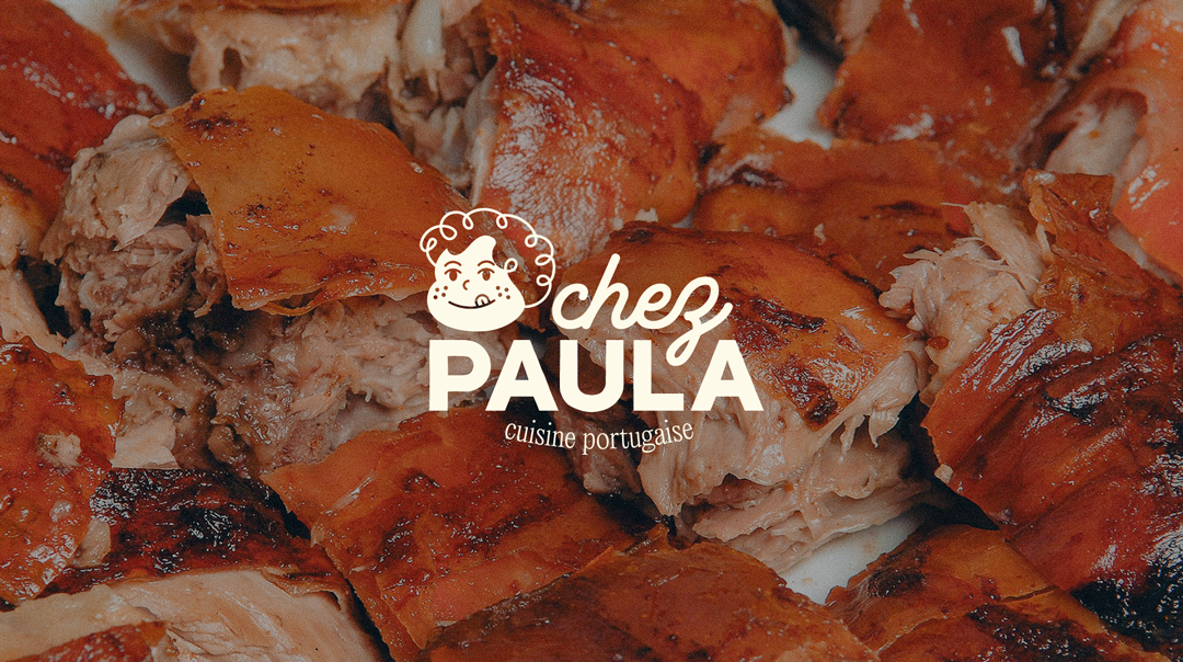
Chez Paula is a food truck in Switzerland serving traditional Portuguese sandwiches. The brand was designed to be fun and attention-grabbing, appealing to drivers looking for a quick and tasty meal.
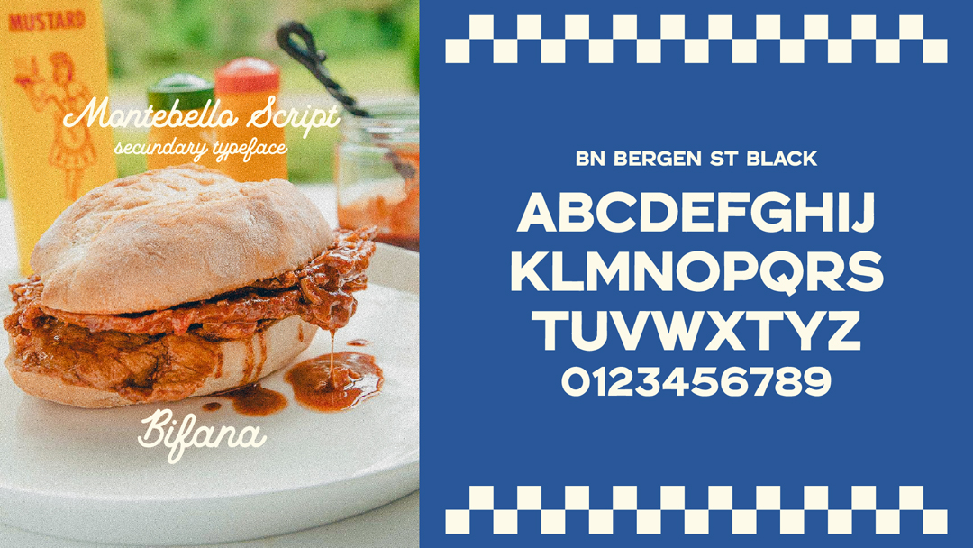
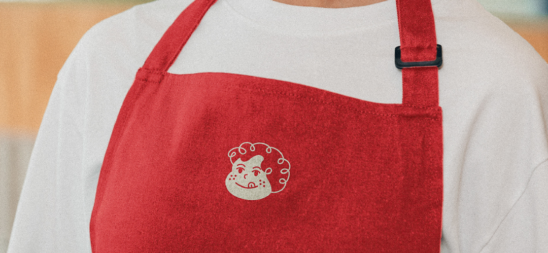
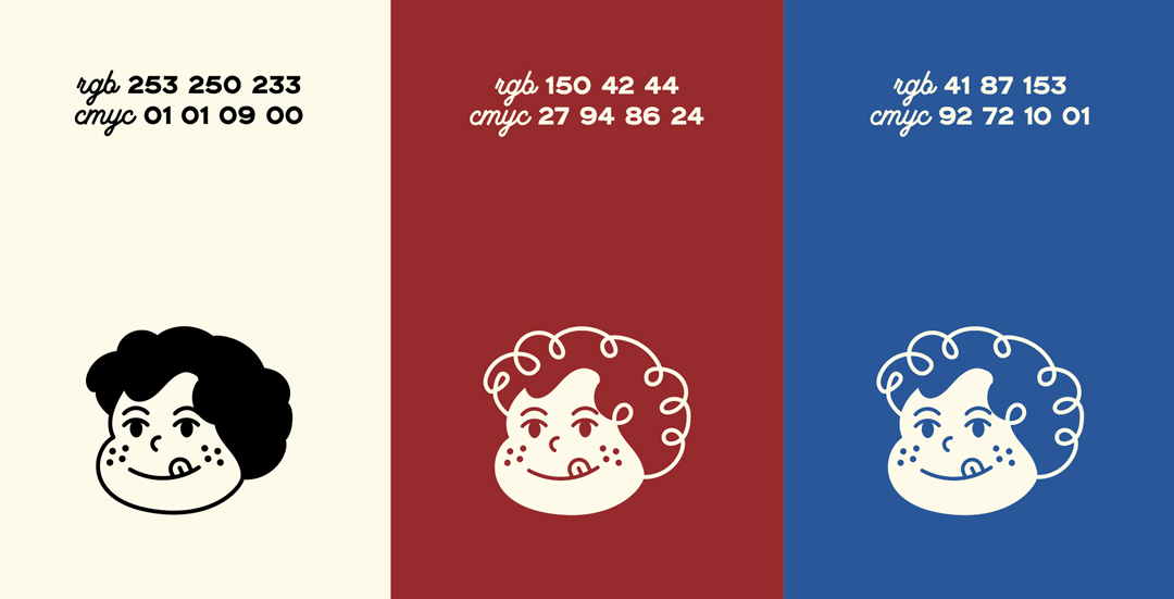
The logo features a character inspired by Paula, the owner, alongside bold typography. The main color is garnet, a nod to Paula’s red hair, complemented by beige and blue, reflecting the Portuguese flag. The brand identity combines product photography with typography to create a strong and recognizable visual style.
Chez Paula brings a piece of Portugal to the road, serving great food with a memorable look.


RaiosRita 2024©
design@raios-rita.com
BianZhiDai by Xiaoyuan Gao, notyourtypefoundry & PicNic by Mariel Nils. Distributed by velvetyne.fr.